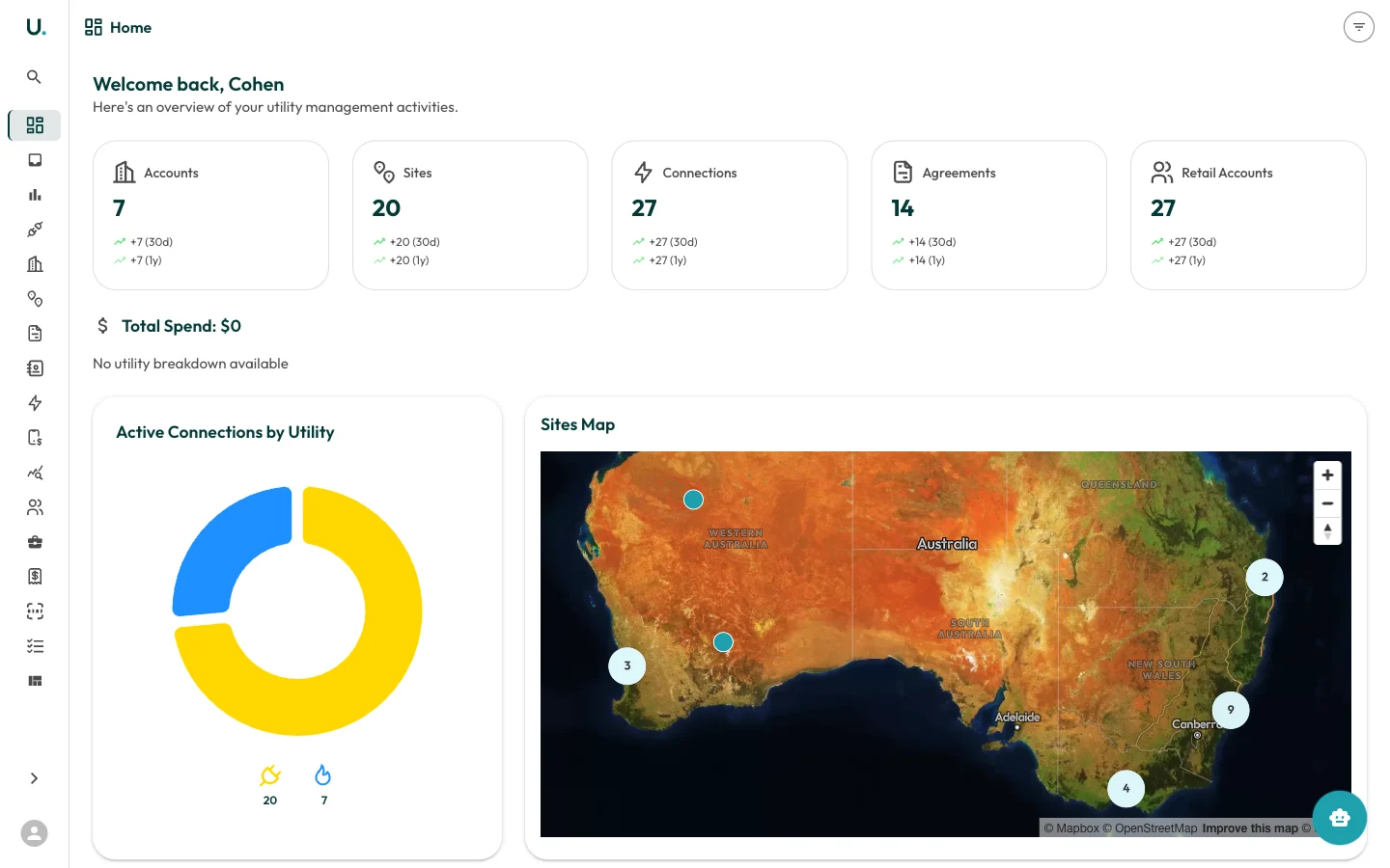
Summary cards
At the top of the dashboard, five summary cards display your key totals:| Card | Description |
|---|---|
| Accounts | Total number of customer accounts in your organisation |
| Sites | Total physical locations across all accounts |
| Connections | Total electricity, gas, and water connections |
| Agreements | Total energy agreements (active and historical) |
| Retail Accounts | Total retail account references with energy retailers |
Total spend
Below the summary cards, the Total Spend section breaks down your energy expenditure by utility type:- Electricity — Total spend and consumption in kWh
- Natural Gas — Total spend and consumption in MJ
- Water — Total spend and consumption in kL
Active connections by utility
A donut chart showing the distribution of your active connections across utility types. Hover over each segment to see the exact count.Sites map
An interactive map of Australia showing the geographic distribution of your sites. Clustered markers indicate groups of nearby sites — click a cluster to zoom in. Individual site markers can be clicked to view site details.Recent accounts
A quick-access list of the most recently created or viewed accounts. Click any account name to navigate directly to that account’s detail page.Agreements expiring soon
Displays agreements expiring within the next 90 days, sorted by urgency. Each entry shows:- Agreement name and type
- Customer name
- Days remaining until expiry
- Expiry date